Rethinking Loss Triangles for IFRS 17: How the Risk Attribution Index (RAI) Reveals the Limits of Frequency–Severity–Inflation Decomposition
ince IFRS 17 went live, insurers have been asked to explain what drives reserve movements in addition to forecasting them. Boards, auditors, and supervisors now expect narrative clarity on the respective roles of frequency shifts, severity trends, and inflationary pressure. Yet many actuaries know the uncomfortable truth: traditional loss triangles were never designed for this kind of decomposition and often cannot support it mathematically.
The Risk Attribution Index (RAI) was introduced to address this gap. Originating from causal-inference methods used in epidemiology and adapted for actuarial data, RAI evaluates whether a triangle contains enough independent structure to support reliable attribution.
In short: RAI tells you when the data themselves allow attribution — and when they do not.
What the RAI actually measures
RAI is neither a model nor a new reserving technique. It is a data diagnostic that measures whether frequency, severity, and inflation leave distinct mathematical signatures inside a triangle. If the patterns overlap too closely, the triangle becomes non-identifiable; even the most sophisticated models cannot separate the effects. This is a frequent problem in inflation-dominated environments, where severity drift, settlement behavior, and economic inflation increasingly mimic each other.
How the RAI emerges from the data
The computation follows three steps:
Step 1: Extract the raw structural variation.
Think of a triangle as containing three overlapping fingerprints:
- Frequency changes leave row-wise patterns (same accident year across all development periods).
- Severity shifts create diagonal or year-over-year cost level changes.
- Inflation produces smooth, calendar-time gradients that affect all years similarly.
RAI measures how distinct these fingerprints are. When frequency drops 20% in one accident year while severity rises 15% and inflation adds 8%, can we tell which drove the total change? Only if their “fingerprints” don’t overlap.
Step 2: Measure how distinguishable these components are
If two components move in parallel (for example, severity rising at the same rate as inflation), they produce collinearity and reduce identifiability. In the RAA triangle, all three fingerprints smudge together — frequency movements correlate –0.66 with severity changes, making them nearly indistinguishable.
Step 3: Combine these measures into a single index.
- RAI < 0.5: reliable attribution.
- 0.5–1.0: attribution possible but uncertain.
- 1.0: attribution structurally impossible.
The crucial point is this: RAI evaluates the data, not the modeler. Even a perfect model cannot decompose what the data do not separate.
Why RAI matters for IFRS 17 governance
RAI enables teams to say: “This quarter’s triangle has RAI = 0.82 — the data permit partial but uncertain attribution,” or, “RAI = 1.10 — attribution is mathematically impossible; any decomposition would be narrative only.” This protects the organization against overconfidence, model-driven illusions of precision, and audit challenges, while improving cross-functional transparency between pricing, finance, and risk departments.
Exhibit 1: Correlation Heatmaps for RAA (Left) and CAS (Right) Datasets
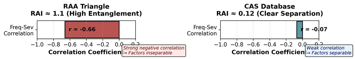
Exhibit 2: Attribution Fan Plots Showing Factor Contributions with Uncertainty Intervals

Applications: What RAI reveals in real triangles
The RAA triangle: A case of masked dynamics.
The RAA triangle exhibits strong collinearity among frequency, severity, and inflation effects. Development-year gradients resemble cost trends, cost shifts mimic inflation, and frequency changes overlap with both.
A correlation heatmap of the RAA triangle reveals why attribution fails (Exhibit 1, left). Frequency and severity show a –0.66 correlation — when one rises, the other falls, creating mirror-image patterns. Development-year effects correlate –0.50 with frequency, and severity-inflation shows –0.32. These deep correlations in the heatmap visualize mathematical entanglement: the data contain a single composite signal, not three separable ones. These “masked dynamics” produce a high RAI ≈ 1.1, indicating that the data do not contain enough variation to uniquely distinguish drivers.
Any decomposition will produce unstable or contradictory estimates. The fan plot for RAA (Exhibit 2, bottom) shows this visually: all three factors (frequency, severity, and inflation) receive near-identical attributions (mean ≈ 33.3% each) with wide, overlapping uncertainty intervals. No factor can be distinguished from the others.
Why this matters
RAI shows when these narratives rest more on professional intuition than on empirical signal.
CAS loss reserve database: Clearer structural separation.
In contrast, many triangles in the CAS database show heterogeneous development patterns:
- Frequency shocks appear as isolated discontinuities.
- Severity shifts manifest in specific accident years.
- Inflation creates smooth year-over-year gradients.
These patterns do not mimic each other, creating room for reliable statistical separation. The CAS correlation heatmap (Exhibit 1, right) shows pale correlations throughout — frequency-severity correlation is only –0.07, frequency-inflation is –0.38, and severity-inflation is –0.17. Each driver varies independently, creating the structural separation needed for attribution.
The resulting RAI ≈ 0.12 indicates strong identifiability:
- Driver-level attribution is stable.
- Different modeling approaches converge to similar decompositions.
- Uncertainty bands are narrow enough to inform governance decisions.
The CAS fan plot (Exhibit 2, top) demonstrates differentiated attribution: frequency contributes approximately 32% of total claim evolution, severity dominates at 58%, and inflation adds 10%. Uncertainty intervals are non-overlapping, indicating reliable separation. The severity factor’s dominance is consistent with industry knowledge that average claim costs drive aggregate loss trends more strongly than claim counts in mature insurance markets.
Practical takeaway
The CAS triangle demonstrates what “attribution-ready” data looks like.
The importance of detecting masked dynamics
- Postpandemic volatility in claim settlement.
- Supply-chain-driven severity inflation.
- Wage-push inflation affecting bodily injury claims.
- Economic inflation altering both cost levels and payment timing.
Without a diagnostic like RAI, actuaries risk assigning narrative explanations to patterns that are mathematically inseparable. RAI formalizes what many practitioners intuitively suspect: some triangles simply cannot tell us the story we are asking them to tell.
Implications for the actuarial profession
RAI does not replace models. It tells actuaries when modeling can legitimately answer attribution questions — and when it cannot.
For IFRS 17, this has three direct implications:
- Audit-ready transparency
Teams can annotate each quarter’s triangle with an explicit identifiability statement: “Q3 triangle RAI = 0.45 — frequency (35%), severity (52%), inflation (13%)” versus “Q4 triangle RAI = 1.20 — drivers non-separable, combined effects narrative provided.” - Governance integrity
Attribution narratives become aligned with what the data support, preventing the common pitfall of misinterpreting noise as signal. - Better resource allocation
When RAI is high, teams know not to overengineer model refinements that cannot overcome fundamental data limitations. Resources can be redirected to scenario analysis or additional data collection.
Conclusion
- Low RAI → reliable attribution.
- Medium RAI → proceed with caution.
- High RAI → attribution not possible; narrative only.
As the industry moves toward stronger governance and more transparent explanations, RAI offers a simple, rigorous, and reader-friendly diagnostic that helps ensure the profession speaks with clarity only where the data allow clarity.